Megan Amy Seamer - Level 3 Media
Wednesday, May 23, 2012
Monday, April 23, 2012
500 word review
I think overall since joining Crawley College and taking photo’s on a regular basis my photography skills have improved, the quality of them and the way I take them. The quality of my photos has improved because I’m using a better camera and now I understand how to take a good photo, this means that I’m more concentrated and I will wait until I think I have ‘the perfect shot’.
When we first started studying the history into photography I came across a woman photographer called Diane Arbus and I automatically fell in love with her style of work, her simple but effective black and white images.
That’s when I started to base my early images around her work because I found her work to be inspiring, I would say that I got one of my favourite images based on Diane Arbus. The image I achieved was of me and it was taken using a Canon EOS 500D and a tripod.
I then took another photo, which I then edited so you can only see my mouth, bottom of my nose and some smoke. I based this photo on Diane Arbus as well, but I then wanted to bring her work into today’s world. I did this by putting some white lines horizontal, I wanted to break up and simple image and give it more dynamics.
Another image I have taken and I feel has come out well is from the rock concert at the hub in Hayward’s Heath College. The photo is of the main singer of a band called Skurvi; the photo that I took was pure luck. He was posing and I had to quickly take the Image, it wouldn’t have looked so good if I just missed it and he was moving his arms down.
I’m also extremely happy with the portrait of Amy Bacon, which I didn’t have to edit in any way. This means that I set up the light rig well and I’m really proud of how the final images came out.
An image that I’m not so happy with is the edited one of Izzy, I think that the photo’s that I got could have been stronger so the final image would of looked better. I personally think that the three images that are edited together at the moment don’t look that great; I would of rather taken more than three photo’s so I had a choice.
Monday, March 12, 2012
Broken glass project
I decided to use a background picture of a pig. I then had to copy across the broken screen affect, chose the right layer then press "sceen" which makes it see-through. I then added it over the top of my original image and it created this.
Wednesday, March 7, 2012
post card from the future, leaflet
here is my finished postcard from the future leaflet:
https://docs.google.com/open?id=0B1Py5m_276MMVUt0bktERUtRNUdIZVpZRlMzTE1jdw
https://docs.google.com/open?id=0B1Py5m_276MMVUt0bktERUtRNUdIZVpZRlMzTE1jdw
Wednesday, February 8, 2012
postcard from the future extra photo
i decied to take another one of my photo's and edit it in a different way. i decided to add in a UFO and an alien, i then changed the brightness of this photo and make the colours darker, so the photo looks more dull.
Monday, February 6, 2012
postcard from the future

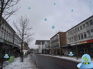 To your right is what i think the future will be like in Crawley town center, i have a before and after image. For my finial image's i have deiced to add in aliens and ufo's in photos of different parts of crawley.
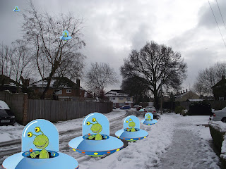
To your left is another photo of Crawley being taken over by aliens, i decided to use a normal street road and show how if aliens do come to this world they will need places to park their UFO's.
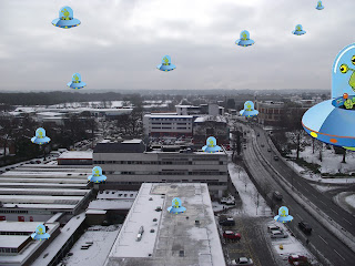 The last photo that i have chosen to use is taken from Crawley College tower block on the 9th floor. I wanted to get a high up prospective of some of Crawley thats why i on purposely went to this side of the building so i could get some of the college in the photo and the County Mall.
I dont personally think the world will be taken over by aliens, but i understand that many people think it will happen and thats why i wanted to see what it would be like.
Wednesday, February 1, 2012
alen sugar
i used the lasso key (L), quickmask (Q), turn the selection inyo a layder ( cmd j), movr the layer to another photo (move tool = v key then drag) and copy the layer (cmd j)
Wednesday, January 25, 2012
post card from the future treatment
(L3) Photography Project Treatment Form
| 1 Type of production and brief details on Subject/Concept that you wish to portray: | ||||||||||||
| I don’t want my photo to be taken seriously, that’s why I want to use cartoon UFO’s. | ||||||||||||
| 2 Facilities: What facilities do you need for this project list all including software and hardware for the whole project I will need a camera, preferably a cannon and photoshop to edit my photos on CS5 | ||||||||||||
| | ||||||||||||
| 3 Finance: If you produced this project outside of the college you need to show how much it would cost to hire the equipment that you intend to use. List the item and the purchase/hire cost next to it | ||||||||||||
| ||||||||||||
| 4 Codes of practice and regulation: What regulations to you need to be aware of. Think about college policy as well as regulatory bodies that you looked at in Term 1 Assignment 2, Worksheet 1.6 Regulation and Safety notes. Say why they are relevant to your project. | ||||||||||||
| Health and Safety at Work Act (1974), Control of Substances Hazardous to Health (COSHH) Regulations (2002), Provision and Use of Work Equipment Regulations (1998), Health and Safety (Display Screen Equipment) Regulations 1992 found here: • Introduction to Rights & Licensing by Pro-Imaging • Organiser’s Guide to the Bill of Rights by Pro-Imaging assessments | ||||||||||||
| 5 Contributors: Who do you need to help this for you project? This includes talent and crew. | ||||||||||||
| Crew and Role: Megan Seamer Photographer and editer Talent and Role: none | ||||||||||||
| 6 Presentation: How will you present the pictures for the factsheet/leaflet? Can you give some rough thumbnails of the final layout? | ||||||||||||
| 1
|
Monday, November 21, 2011
photography in motion
I decided to chose photography in motion because i find it very interesting, how you can capture something one second and a second later the image would be compleatly different.
For this project i decided to capture myself smoking and a lighter blowing in the wind. I know photos of people smoking isnt original but i wanted to take something thats been done before and make it different to other images, i've done this by changing the colour and the sizes of the images that im using.
My photos before i edited them:
My photos after theyve been edited:
Photo number 1:
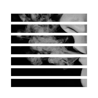
I decided to first of all crop this photo so all you got in the picture was part of my face and my mouth blowing out the smoke. I then edited the photo to make it black and white, when looking at the photo i found it to be quite boring just black and white so i then decided on photoshop to cut the image into shapes, i used the grid tool and seperated the image into rows of 4 boxes tall. I think using the effect has made this image more creative and interesting.
Photo number 2:
For this image i didnt have to edit it alot, i wanted the main focus to be on the lighter swaying in the wind, i then edited the colour slightly so the image was slightly brighter. After i had done most of the colour editing i wanted to do something else to make this image more creative and different so i decided to tile the image into 4x4 squares, i did the same process as the picture above but i think that this image is more affective, its more creative and its also an optical illusion.
Photo number 3:
For this image i cropped out most of the image leaving the smoke rising and the lighter flame. When i came across this image i wasnt sure what i wanted to do with it, I knew that i didnt want the full image, so i cropped it. I then started playing with some different effects, first off all i made it black and white but i didnt feel that the image was at its full potentual. I then started messing around with the light and colour and it gave me this image, I really like the effect that ive got. The light flames sharp, the smokes got quite a few different tones and overall i think this image looks more detailed because off the affects i chose.
Photo number 4:
For this image i wanted to just focus on the face so i cropped out the rest of the body. I then made it black and white which gave it a vintage feel which i really like because thats the affect i was going for, i then decided to make this image black and white, i think because the photo is already very simple the lack of colour reflects the simplicity of the photo. I also changed the light setting which made the smoke clearer and you could see the rain falling easier, it made it look like little white specks.
Over all I think that my favourite photo's would be either 2 or 4, I picked these two because theyre both compleatly different to each other. I picked photography 2 because the photo is quite simple but the fact that ive edited the image into little squares makes it more intresting. I also like how simple picture 4 is, i feel that its got quite an elegant feel too it because its so plain and basic.
For this project i decided to capture myself smoking and a lighter blowing in the wind. I know photos of people smoking isnt original but i wanted to take something thats been done before and make it different to other images, i've done this by changing the colour and the sizes of the images that im using.
My photos before i edited them:
My photos after theyve been edited:
Photo number 1:

I decided to first of all crop this photo so all you got in the picture was part of my face and my mouth blowing out the smoke. I then edited the photo to make it black and white, when looking at the photo i found it to be quite boring just black and white so i then decided on photoshop to cut the image into shapes, i used the grid tool and seperated the image into rows of 4 boxes tall. I think using the effect has made this image more creative and interesting.
Photo number 2:
For this image i didnt have to edit it alot, i wanted the main focus to be on the lighter swaying in the wind, i then edited the colour slightly so the image was slightly brighter. After i had done most of the colour editing i wanted to do something else to make this image more creative and different so i decided to tile the image into 4x4 squares, i did the same process as the picture above but i think that this image is more affective, its more creative and its also an optical illusion.
Photo number 3:
For this image i cropped out most of the image leaving the smoke rising and the lighter flame. When i came across this image i wasnt sure what i wanted to do with it, I knew that i didnt want the full image, so i cropped it. I then started playing with some different effects, first off all i made it black and white but i didnt feel that the image was at its full potentual. I then started messing around with the light and colour and it gave me this image, I really like the effect that ive got. The light flames sharp, the smokes got quite a few different tones and overall i think this image looks more detailed because off the affects i chose.
Photo number 4:
For this image i wanted to just focus on the face so i cropped out the rest of the body. I then made it black and white which gave it a vintage feel which i really like because thats the affect i was going for, i then decided to make this image black and white, i think because the photo is already very simple the lack of colour reflects the simplicity of the photo. I also changed the light setting which made the smoke clearer and you could see the rain falling easier, it made it look like little white specks.
Over all I think that my favourite photo's would be either 2 or 4, I picked these two because theyre both compleatly different to each other. I picked photography 2 because the photo is quite simple but the fact that ive edited the image into little squares makes it more intresting. I also like how simple picture 4 is, i feel that its got quite an elegant feel too it because its so plain and basic.
Wednesday, November 9, 2011
Treatment Photography
1. Type of production and brief details on Subject/Concept:
For this project im going to take photographs of someone smoking, its under the group of photography in motion.
2. Facilities: What facilities do you need for this project list all including software and hardware for the whole project
For this project i am going to a section in Horsham park.
3. Finance: If you produced this project outside of the college you need to show how much would it cost to hire the equipment that you intend to use.
Because i am using a public area to take my photographs the setting wont cost me anything.Because i am taking the photos when its just starting to get dark i have natural lights which means that i don’t need to hire out any lights.The only thing that i would have to buy is the camera (canon EOS 500D) which would cost £550 and a tripod which costs around £80.
4. Contributors: Who do you need to help this for you project? This includes talent and crew.
For this project i am going to need a model.
5. Codes of practice and regulation: What regulations to you need to be aware of. Think about college policy as well as regulatory bodies that you looked at in assignment 2, Worksheet 1.6 Regulation and Safety notes
6. Presentation: How will you present the pictures? Will you include a soundtrack, think about copy write issues etc.
I am going to present my pictures in a set of four and make them all different sizes and shapes so they’re all different.
Wednesday, October 19, 2011
Fashion photography
Is it right to edit a person so much that they lose their identity, they're not the person in the original photo..

As you can see above there are two pictures of the same man, one has been edited and one is the original. He has a visible small scratch on the top off his head, and a tiny red mark next to his nose. After the photo had been edited, both marks were gone, his skin was alot smoother and his eyes have changed colour, from green to a blue. Because this photo has been edited, but has it changed the person? hes no longer the guy with the scratch on his head, as its been edited out.
The use of Photoshop is used worldwide in almost every magazine the models will off been edited in some way, for example slicker and smoother skin, less or even no dimples or spots, skinner and also sometimes prettier, but real beauty is not edited.Surely fashion photography should be all about showing the latest collection and advertising different companies? No matter what size or colour you are you should be able to model without being edited. Fashion photography is about creating everything infront off the camera and catching natural beauty,

This woman to your left is classed as a plus size model but in fact shes one dress size under the average size for women in the U.K, shes a size 14. In the U.K with obesity slowly growing the average dress size for women has increased to a size 16 in almost 2 years.
 Many people think that you only see size 0 models on catwalks but many highstreet shops are currently using size 0 models to advertise their clothes with, for example Topshop. When Topshop decided to upload this photo off Codie Young it triggered a furious response from eating disorder campaigners and it was soon removed, only to be replaced by another photo of the same model, looking only marginally healthier. Its been noted that Topshop are selling size four clothes in many of their stores, which implies that being a size 4 is healthy. Topshop needs to take some responsibility and use healthy models.
In my opinion i dont think that fashion magazines should edit their photo's, i believe that the models that they put in there should be unedited and a natural size.
As you can see above there are two pictures of the same man, one has been edited and one is the original. He has a visible small scratch on the top off his head, and a tiny red mark next to his nose. After the photo had been edited, both marks were gone, his skin was alot smoother and his eyes have changed colour, from green to a blue. Because this photo has been edited, but has it changed the person? hes no longer the guy with the scratch on his head, as its been edited out.
The use of Photoshop is used worldwide in almost every magazine the models will off been edited in some way, for example slicker and smoother skin, less or even no dimples or spots, skinner and also sometimes prettier, but real beauty is not edited.Surely fashion photography should be all about showing the latest collection and advertising different companies? No matter what size or colour you are you should be able to model without being edited. Fashion photography is about creating everything infront off the camera and catching natural beauty,
This woman to your left is classed as a plus size model but in fact shes one dress size under the average size for women in the U.K, shes a size 14. In the U.K with obesity slowly growing the average dress size for women has increased to a size 16 in almost 2 years.
In my opinion i dont think that fashion magazines should edit their photo's, i believe that the models that they put in there should be unedited and a natural size.
Subscribe to:
Comments (Atom)


